
Rt is a key measure of how fast the virus is spreading. It’s the average number of people who become infected by an infected and infectious person. Rt = 1 means one infected person infects one other person on average. If Rt is above 1.0, the virus will spread quickly or logarithmically. For example, if Rt = 2, the progression of infected persons from that one index case goes 1,2,4,8,16,32,64,128,256,…etc. When Rt is below 1.0, the total number of infected persons will start to decrease.
https://rt.live/ is a really cool site that tracks the Rt number, by State, and over time.
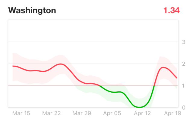
Here are some examples, but you really should go to the website and look for yourself.
These are the current data for every state in the Union. In green are the states with Rt below 1. In red are the states with Rt above 1:

This was 3 weeks ago:

This is current and highlights the states without stay-at-home (shelter in place) orders:

Rt numbers over time per state:


You can also superimpose these curves with the curves of new cases:

Persistent low Rt numbers as in the case of New York since early April, seems to correlate with “flattening of the curve” of new cases. The reverse also holds true in some states like Ohio where a recent uptick of the Rt number between April 12-19 corresponds with increased numbers of new cases and no flattening of the curve.
I signed up on https://rt.live/ to get updates by email and twitter. I recommend that all those making COVID-19 related decisions, whether nationally or locally, follow these data carefully. They may provide a guide for cautiously reversing stay-at-home orders in some locations.
Please remember: our health and our economy are one and the same.